Yesterday I discussed the fonts used at Epcot. Today I’ll be looking at the typefaces used at Disney’s Hollywood Studios. But first let’s take a gander at the old logo for this park.
Three fonts were used for The Disney/MGM Studios. The names “Disney” and “MGM” used their official corporate typeface while “STUDIOS” used a font called Marquee.
The new logo uses a typeface extremely similar to a font called Playwrite. These letters have an Art Deco feel which is consistent with the architecture found on Hollywood and Sunset Boulevards.
The letters at the front of the park uses another Art Deco font.

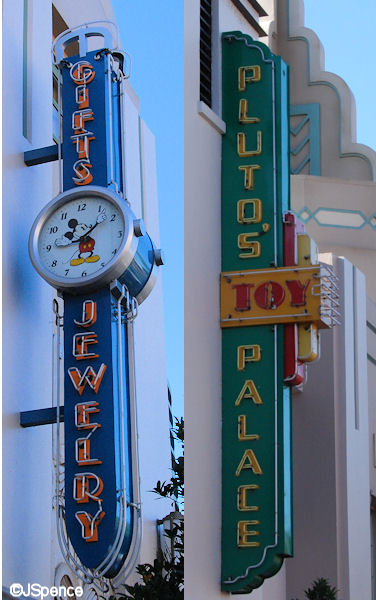
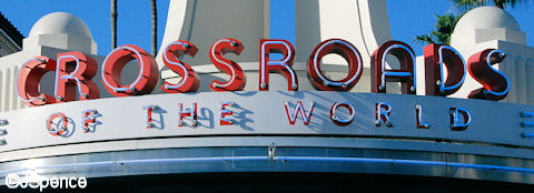
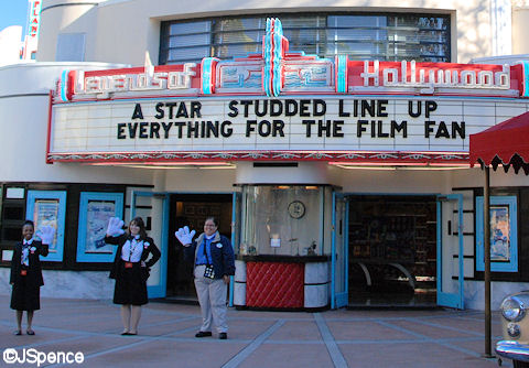
For the most part, the signs on Hollywood Boulevard continue to use clean and stylish sans-serif fonts of the Art Deco style. But what sets this street apart from other locales is the illumination of the letters with neon tubing. The origin of tubular lighting is in dispute, but it is generally believed it came into existence at the end of the 19th century. Common use of the neon signs began in the early 1930’s and caught on quickly.

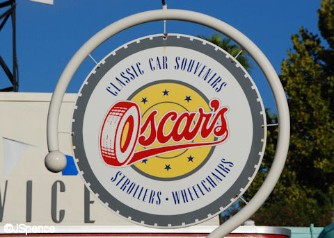
“Oscar’s” is a fun sign. It’s round like a wheel and uses a tire to make up the “O.” And I also have to wonder if this designation was selected because the word “car” is contained in the name.
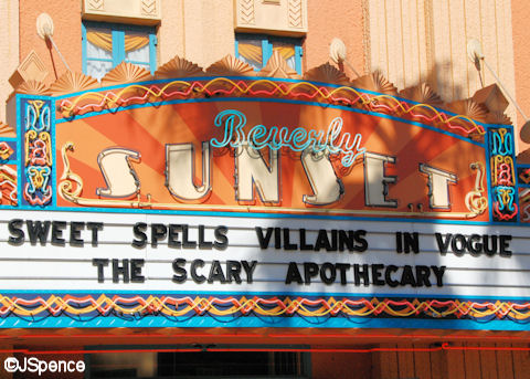
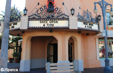
Sunset Boulevard is lined with movie houses. Although neon lighting and Art Deco fonts are popular here, much of the signage is placed on the theaters’ marquees. Simple black letters that can easily be changed from week to week look down on the guests from an illuminated white background.
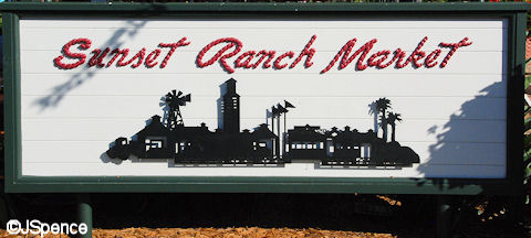
The Sunset Ranch Market was once a working farm with horses and cattle. So it is befitting that the font used to designate this now open-air market is a rope that was once used to maintain the animals.
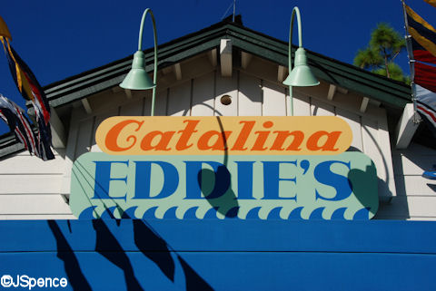
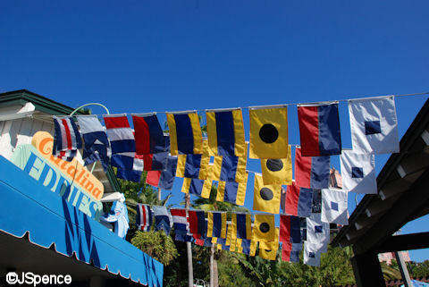
Fonts come in many shapes and sizes, including nautical signal flags. Have you ever wondered what the pennants spell at Catalina Eddie’s? CATEDDIES
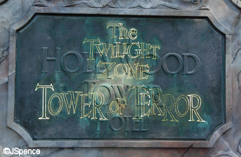
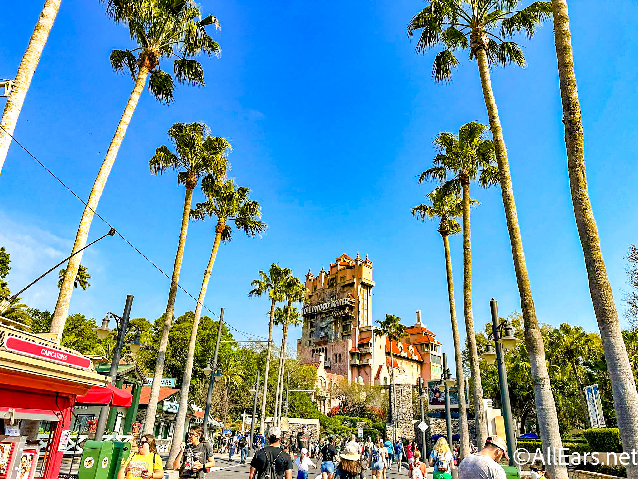
The “Tower of Terror” uses two fonts. First, there is the stately serif font that represents the Hollywood Tower Hotel. Then there is the Twilight Zone font. This is the same typeface as used in the CBS television show by the same name at the beginning of each episode.
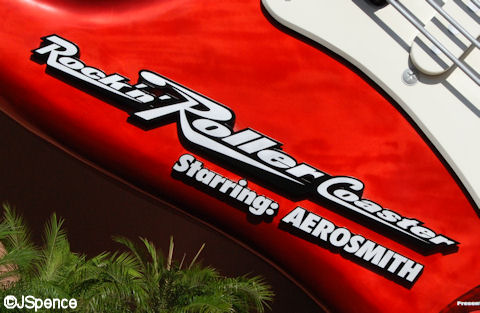
The font used on “Rock ‘N’ Roller Coaster” looks fast. The slanted letters and underlined words tell the guests they’re in for a high-speed journey.
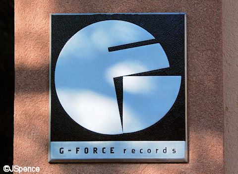
An ingenious combination of two letters creates the logo for G-Force Records, the recording studio that houses “Rock ‘N’ Roller Coaster.”
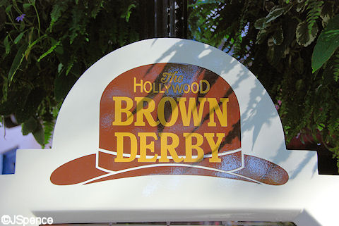
The first Brown Derby Restaurant opened in 1926 and its whimsical architecture became synonymous with the Golden Age of Hollywood. Disney’s version of this famous eatery is based on the second Brown Derby and is designed in the Spanish Mission style. However, the original eye-catching logo is still used.
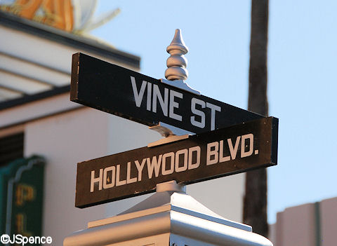
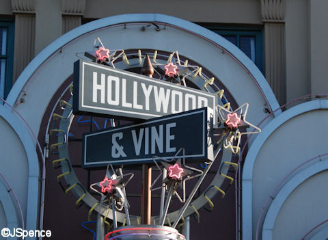
A number of street signs can be seen along Hollywood Boulevard, including one of the most famous of them all. So it’s no wonder that a restaurant would borrow the name, look, and font to create a catchy sign.
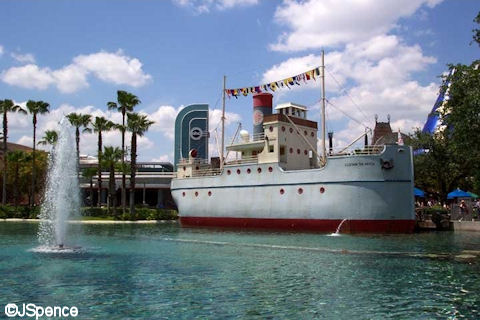
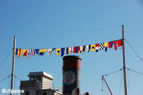
The insignias over the S.S. Down the Hatch alternate between flags and pennants. The flags represent letters, the pennants represent numbers.
The flags spell out: D O C K S I D E D I N E R
The numbers are: 7 8 2 5 6 2 8 9 6 3 5 4
I have no idea the meaning of the numbers.
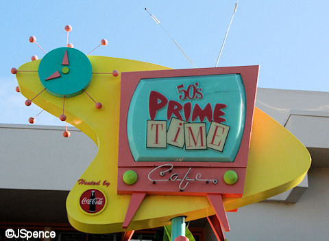
Everything about this next sign reeks 1950’s America. The shape, the clock, and especially the fonts all recall a simpler time. If you’d like to add a font to your computer similar to “PRIME” as seen on this sign, Google “Cheap Motel Font.”
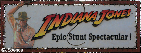
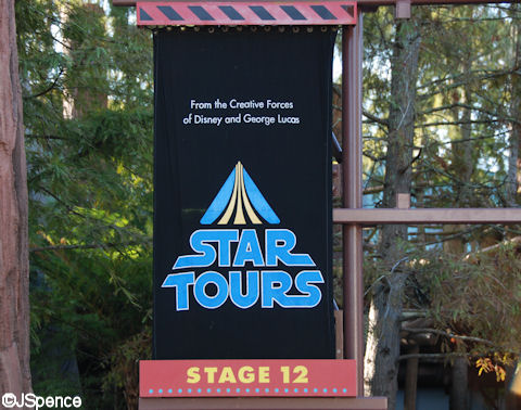
Both “Indiana Jones Epic Stunt Spectacular” and “Star Tours” use the same fonts that were seen on movie posters and theater marquees. This helps guests associate one to the other.
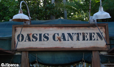
Near the “Indiana Jones” show is a quick service restaurant and a souvenir stand. These establishments use a military stencil on their signs to tie them into WWII, the era in which Indy was fighting the Nazis.
Other souvenir stands around the park promote a movie theme by cleverly placing letters on a film strip.

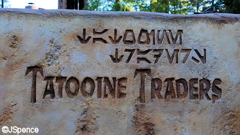
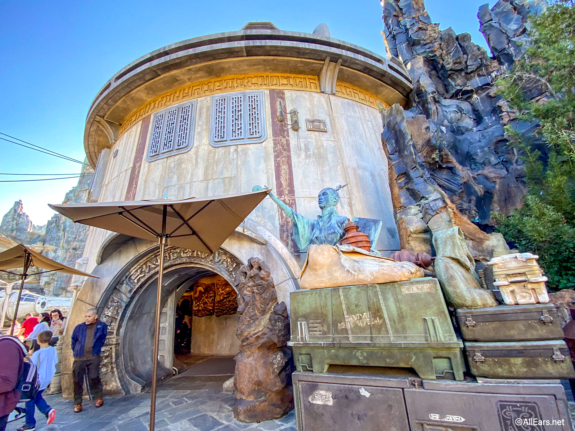
Tatooine is the home planet for Anakin and Luke Skywalker. It is a dry planet and moisture farming is a way of life here in order to survive. So it’s fitting that the Tatooine Traders sign is etched into rock. Both English and Tatooine lettering is used.
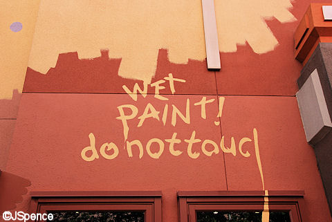
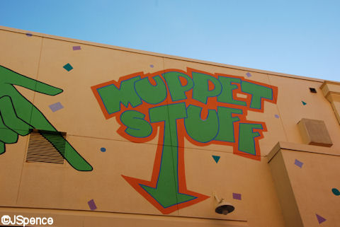
Although not advertising a place or product, these Muppet-painted signs effectively set a mood of zaniness and mischief.
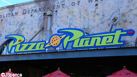
Once again, continuity is extremely important. The lettering used for the Pizza Planet Restaurant is exactly the same as the pizzeria Buzz and Woody head off to in the movie “Toy Story.”
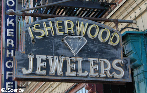
There is a wide assortment of signs and lettering on the “Streets of America.” All are apropos of a big city.
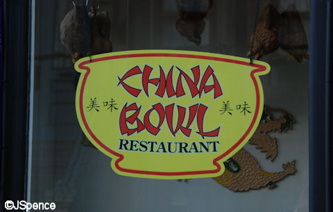
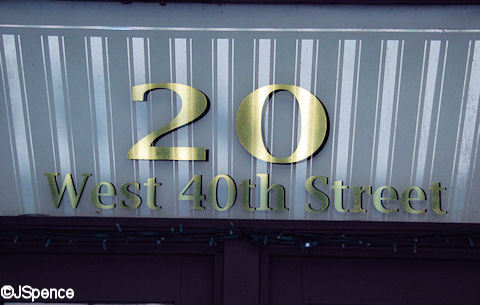
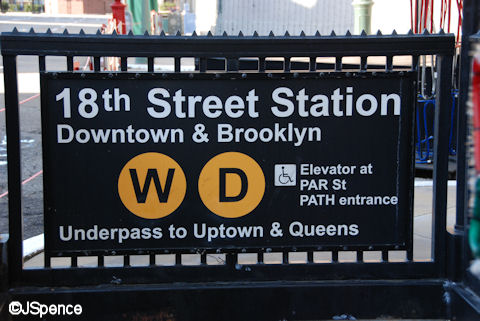
This New York subway sign uses the same font and symbols as the actual transit signs in the Big Apple. And it’s no accident that the “W” and “D” lines were depicted here.
Sometimes the words overshadow any font used.
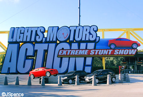
As in a number of other attractions, slanted letters give us the illusion of speed on the “LIGHTS, MOTORS, ACTION, Extreme Stunt Show” sign. In addition, a tachometer has been substituted for the “O” in “MOTORS” to accent this point.
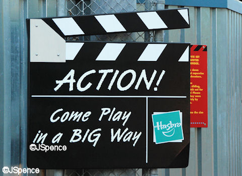
The font on this giant clapboard looks like it was handwritten in chalk.
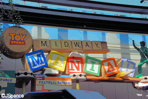
What better typeface could there be than Alphabet Blocks and Scrabble Letters to create the signage for Toy Story Midway Mania.
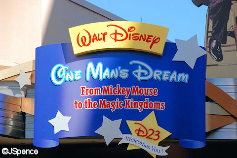
If you’re going to tell the story of Walt Disney, what better lettering could you use than his own handwriting? By the way, if you’d like to download the Disney font to your computer, Google: Walt Disney Script
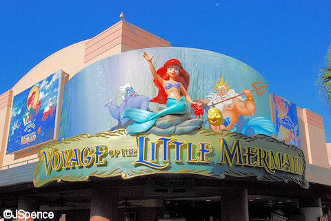
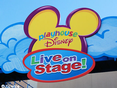
Both “Voyage of the Little Mermaid” and Playhouse Disney Live on Stage” use their theatrical and television fonts. Once again, continuity helps tell the story.
Well, that’s all I have for fonts at the four theme parks. In these four blogs I’ve posted over two hundred photographs, yet I’ve barely scratched the surface on this subject. Signage and lettering are extremely powerful storytelling tools and I hope my article has helped you realize this. As I’ve said so many times, Disney puts a tremendous amount of thought into everything they do. No detail is too small.

I realized something regarding Catilina Eddies.
On Imdb I saw this quote from who framed rodger rabbit.
Dolores: Should be. Haven’t had that film developed since our trip to Catalina. Sure was a long time ago.
Eddie Valiant: Yeah. that was along time ago. We should do that again some time.
Dolores: Yeah, sure, Eddie.
Catalina was where Eddie, Dolores and Teddy went for vacation.
Catalina and Eddie valiant make the name of
the resturant!
You’ve always said to slow down and smell the roses!
Fantastic!
For thirteen years I worked in a publications office and know how important font styles have on the reader of posters, advertisements in magazines and street signs etc. I thoroughly enjoyed the planning stage and experimenting with fonts, colours and layout. It was great to see a pencil draft come life and give the product, concert or campaign an identity that people could use to remember.
Thank you Jack for this series I thoroughly enjoyed it. It allowed me to have my Disney Fix as I ‘wandered’ around each park and also the wonderful memories of fun, laughter and happy tears.
Thanks again
I have to admit I like the new Studios sign. It is a little more sophisticated. In fact I was able to download it and created a scrapbook layout with it. If you like I can send it.
really enjoyed these 4 blog entries Jack, fonts & lettering will be another thing for me to look at during my next trip.. just 3 weeks to go now! 🙂
Hi Jack,
I just finished reading all the blogs today (I’m behind this week – what can I say!). This was a fantastic blog – I have an art background and I come from a newspaper family so I’ve always been interested in the various typefaces so this was really neat.
The amount of information you have in all of these blogs is amazing – I don’t doubt you one bit that it took 30 hours to complete.
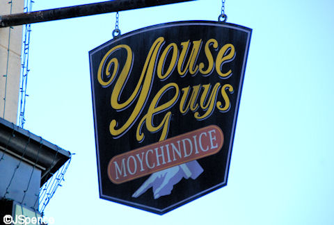
By the way the sign for “Youse Guys Moychindice” at HS has always been one of my favourites – I like to read it outloud when we go by imitating Marisa Tomei or Joe Pesci in My Cousin Vinny!
Can’t wait until we get there in February to brush up on everything you’ve taught us this year.
Thanks again,
Wendy
First of all, I’ve been reading your blog for a long time but I’ve never commented until now, and I just wanted to say I love all your stuff!
And second of all, just a random bit of info about the Tatooine Traders sign… The alphabet used is called Aurebesh, and was used throughout the entire Star Wars galaxy, not just on Tatooine. So yea, just thought I’d let you know!
Keep up the great posts!
Hubby and I are going to WDW in January for the first time in about 15 years and your blog posts are helping us to look forward to it more and more each day. Thanks!
hey jack
This last blog in the series really was a great end. the detail in hollywood studios is the best in my opinion because there is a wide spred arangement when it comes to attractions. there are some kiddy ones as well as more grown up ones. can’t wait for your next blog and as always, keep up the great work
These blogs were so interesting, Jack! I can’t wait to really appreciate all these great details in person when I’m there next month. Thanks!
Thanks for posting these four blogs! The attention to detail is just perfect for Disney. I have started looking at signs around me at home to see how they tell or don’t tell the “story” and match what they are used for.
Jack,
Every time I read your blogs, I feel the need to add on at least a week to each of my trips to WDW to take note of everything. Thanks again for an amazing look into the details that make the “World” so special.
Ashley