

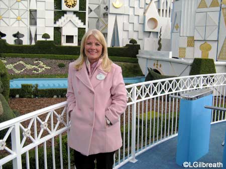
The day before “it’s a small world” reopened at Disneyland, I had the opportunity to go on a ride-through of the attraction with Imagineer Kim Irvine, art director for the “small world” project. What follows is a transcript of Ms. Irvine’s comments while we were going through the attraction.
(Ms. Irvine was asked what changes were made.)
Kim Irvine: “A big part of it is the lighting, our WDI lighting
designer worked really hard to come in and enhance the sets with
colors that actually boost the color instead of putting it…You
know there’s a tendency if you’re a painter to try to put complementary
colors but it usually turns things brown. You push the colors with
these wonderful hues that accent what was there – it makes a huge
difference. When you turn the show lights off, and go into work
light, it’s ‘Oh, what happened’, you know it just looks so much
better.
“Have you noticed how bright and fresh it looks as well? The team did a
great job of doing an overall lighting, repainting and reglittering.”
(On deciding which Disney characters to use and where.)
KI: “Well, we looked at the ones that were done for Hong Kong and then
we pared them to the ones we felt comfortable in the existing scenes
because we did not want to change. So England was perfect for Alice
in Wonderland and Peter Pan. Cinderella fit perfectly in France.
So there’s stories that were written in all of these different
countries – Pinocchio in Italy – they just fit. That’s how we
picked.
“With the Disney dolls and with America, it was so easy to seamlessly blend
that in with the existing ride since it is about all the different lands,
and all of those stories come to us from all of those different countries.
And you know [someone] used to tell me research is 90% of your job.
Looking back into Mary’s files — everytime we’ve done anything in here we’ve
looked closely at all of her original concept art. That was actually done
collage-style, torn tissue, they’re just beautiful, you know how
bright her color choices are. She had done a lot of illustrations for
Cinderella, for Peter Pan, for Alice in Wonderland, so it was easy to see
how her style would lend itself to doing the Disney characters.”
“I refer back to Marty’s original guide of small world, it has a lot of
really great pictures in it that are historic. And also, we have a thing
called image browser, we can look at pictures that have been taken
through the years of an attraction to see if anything is missing.”
“We ourselves feel very responsible for making sure that we do
things carefully, in reverence to the original attraction. In
anything we do down here at Disneyland being the on-site WDI Team,
the charge is kind of to keep things relevant and keep improving
the park and especially when we have these really long rehabs,
trying to come back with something new. John [something] was my
mentor and he impressed on me constantly, you gotta keep refreshing
things – put new color schemes on Main Street, add things to the
attractions – that’s what the park is all about.”
“That doesn’t mean change the story. But that’s what we have to do
is make sure that we’re sticking to the story, we understand exactly
what the original intent was, when we add something it needs to
seamlessly fit in like we tried to do here. And I do understand
when fans are concerned because like I said, if I just heard the
basics of what was happening I’d be concerned too.”
“Can you hear the little musical threads? Some people hear them and some
people don’t. It’s like a hearing test. It was meant to be subtle.”
(While passing through the China scene.)
KI: “By the way, there’s a recording there of Chinese instruments that was
done for Hong Kong – it doesn’t have anything to do with Mulan, but we
were able to insert it in here because it’s so beautiful. Next time you
go by it has all the Chinese instruments that we never had before.”
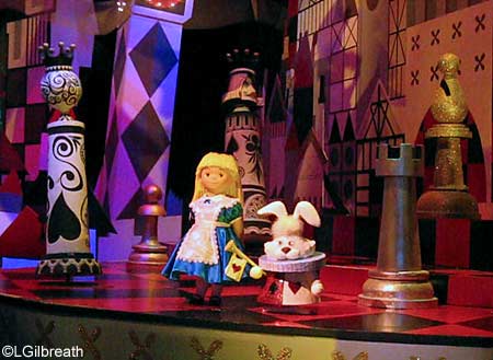
(Asked about the appearance of the Disney characters and what influenced
the design decisions.)
KI: “Tony and I looking at them and trying to decide what needed
to happen so that people would recognize it as the character and
how well did that fit in with the Mary Blair style. So Flounder
happened to look perfect in that mermaid scene with all of the
other fish – his styling fit perfectly.”
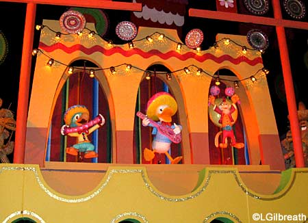
(Asked about Donald being the only member of the Fab 5 that’s in the attraction.)
KI: Yes, that’s the Three Caballeros – it was a perfect story for South
America.
(Regarding the new “Spirit of America” scene.)
KI: “Tony found an original piece of art that Mary did, a scene of
America, the American west with kind of a Sedona hills behind it,
all torn tissue paper, cowboys and Indians in it. She had always
intended to have it in there – we’re the only [small world] attraction
that doesn’t have an American representation – there’s one in the
other theme parks. And she has the cowboy and Indian in the finale
– it’s meant to be the coming together of all of the countries in
that one space, so to me that’s further indication she would have
been happy with having them there.”
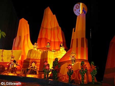
“The farmland, the America scene in other parks, is pretty large,
especially Paris. So we took the pieces that we thought would
fit in this room the best and would represent America the way other
countries see us. And they are such happy scenes – I think it’s
how a child would depict America, cowboys and Indians and farmland.”
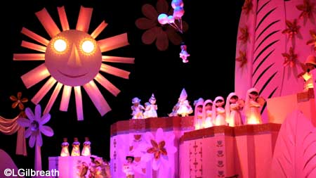
“I love how Mary put a different kind of sun or moon in almost every
room – that’s why we added one to America, too – that little half
sun, half moon.”
(Re: changes in the “Goodbye Room”.)
KI: “You know, it was originally all white and silver and gold with
colored light and those days it was those aluminum Christmas tree
lighters it was just a rotating color gel, so with today’s technology
we were able to put in this amazing light changers, with that
dazzling finale like Fred Astaire would be dancing around in his
white suit.”
“The lavender blue color scheme I worked on that, too, so I feel
responsible for that. Right after we opened Walt Disney World and
they did their finale in lavender blue and it was pretty, but it
doesn’t have the same kind of finale effect that this does.”
[Something about adding back the sun] “…he’d been gone for a long
time. At the [World’s] Fair they had a big banner that said ‘Come
Again”‘ so we thought the [Farewell] banner was a great way to end
that room rather than just a square hole.”
(Asked if she is pleased with the results.)
KI: “Yes. I think it turned out beautifully with as many people
and hands that have to work on these things, trying to keep the
vision in every discipline’s head of what it is that we’re trying
to work from. I think that’s why the tools we use — being a model,
a completely painted model, doing color boards…You know there’s
a lot of different facets to this design but it really helps
communicate to everyone that’s going to work on it what the end
product wants to look like. Mary’s style particularly being so
child-like it’s almost like you have to paint with your left hand
to make it look like her style. Real trained artists have difficulty
doing that so they really had to work hard at it.”

Thank you to Ms. Irvine for taking the time to ride the attraction and discuss it with us – it was an honor and a wonderful experience!


Trending Now
Many Magic Kingdom fans will be glued to their devices on May 14th!
ALERT! Three adorable Disney Loungefly bags are on sale RIGHT NOW online!
One part of EPCOT is about to get REALLY quiet.
Seriously, you'll regret not buying these six Disney items on sale on Amazon now!
Disney Springs just solved a MAJOR souvenir problem!
There's one GLARING issue with this Walt Disney World hotel that may have you rethinking...
High expectations are completely understandable when you're planning the perfect trip to Walt Disney World,...
Get your next pair of Disney shoes at Walmart!
Amazon has a TON of cute new Disney Loungefly backpacks perfect for a Disney World...
Catch up on ALL of the newest Disney menu changes right here before your next...
We'll never let our anger go over these changes.
It's official. Disney World Annual Passholders will get to ride Magic Kingdom's new ride early!
We are covering some unspoken rules for what Gen Z are wearing to Disney World!
Here's why you should consider a stay at the Walt Disney World Swan and Dolphin.
A snack spot in Disney's Hollywood Studios just disappeared!
Here's a look at the latest construction update on one of the roller coasters coming...
We've gotta talk about a couple of things Gen Z does differently at Disney World...
Calling all my fellow anxious friends! Here's how to lower that anxiety a bit before...
Will a Disney World trip in 2024 cost you MORE than you expect or much...
The OFFICIAL announcement for the opening date has just been given (and it was on...